UCIML datasets from their API, Kernel machines, Barplot with percentages annotations, pie charts, Imbalance ratio

Daily Note - 03/06/2024
1. Downloading UCIML datasets from their API
!pip3 install -U ucimlrepo Documentation about the API here
2. Barplot with percentages annotations
A barplot with percentages annotations can be very useful to show the distribution of a categorical variable.
An easy way to do this is using pandas and matplotlib.
The first thing is to create a fig, ax object with matplotlib and specify the number of subplots that we are going to use.
fig, ax = plt.subplots(1, 2, figsize=(12, 6))Then, we can use the value_counts method from pandas to get the counts of each category in the variable.
yo.value_counts(normalize=True).plot(kind='barh', ax=ax[0])Because we are ploting two plots we are going to do the same with the other one.
df.Target.value_counts(normalize=True).plot(kind='barh', ax=ax[1])We can use the set_title method from matplotlib to add a title to each plot
ax[0].set_title('Original Dataset')
ax[1].set_title('Train Dataset')
Here is the most oscure part of the code. First we need to iterate through the axes by for axis in ax. This line iterates over the axes in the ax array. ax is an array of the axes object created by plt.subplots. So contains the two axes that we created, ax[0] and ax[1]. After this we need to iterate through the patches of the barplot. Each bar in the bar plot is represented as a patch in matplotlib. axis.patches contains all the bars in the current axis.
for axis in ax:
    for p in axis.patches:
To calculate the percentages, we can retrieves the width of the bar, which corresponds to the normalized value using p.get_width(). f'{p.get_width() * 100:.2f}%' creates a formatted string representing the percentage with a ‘%’ symbol. perc = f'{p.get_width() * 100:.2f}%'
In order to add the percentage to the bar, we can use axis.annotate method. This method adds an annotation to the plot. (p.get_width(), p.get_y() + p.get_height() / 2) sets the position of the annotation. p.get_width() is the x-coordinate of the annotation, placing it at the end of the bar. p.get_y() + p.get_height() / 2 is the y-coordinate of the annotation, centering it vertically within the bar. ha='left' sets the horizontal alignment to the left. va='center' sets the vertical alignment to the center. xytext=(-50, 0) specifies an offset for the text position (moving the text 50 points to the left of the bar). textcoords='offset points' tells annotate to interpret the xytext offset as being measured in points from the (x, y) position.
        axis.annotate(perc, (p.get_width(), p.get_y() + p.get_height() / 2),
                       ha='left', va='center', xytext=(-50, 0), textcoords='offset points')
The final code is:
fig, ax = plt.subplots(1, 2, figsize=(14, 6))
yo.value_counts(normalize=True).plot(kind='barh', ax=ax[0], color='skyblue')
ax[0].set_title('Original Dataset')
df.Target.value_counts(normalize=True).plot(kind='barh', ax=ax[1], color='skyblue')
ax[1].set_title('Train Dataset')
for axis in ax:
    for p in axis.patches:
        perc = f'{p.get_width() * 100:.2f}%'
        axis.annotate(perc, (p.get_width(), p.get_y() + p.get_height() / 2), ha='left', va='center', xytext=(-50, 0), textcoords='offset points')
plt.tight_layout()
plt.show()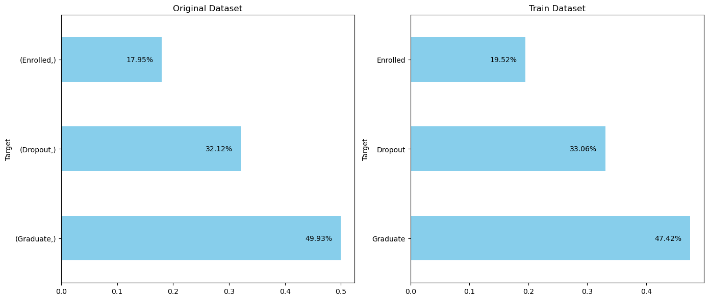
3. Don’t use pie charts
The main issue is that humans are generally not good at accurately estimating areas and angles. In a 2D pie chart, the sie of each slice is determined by the angle and the area it occupies, which can be hard to compare precisely. A bar chart represent data with the length of the bars along a common baseline, which makes it easier to compare the values. This linear representation (lenght of bars) is more intuitive and allows for more accurate visual comparisons than the angular or area-based representations of a pie chart.
4. Imbalance ratio
To assess the imbalance more precisely, one common approach is to calculate the imbalance ratio. This ratio can be computed as the number of instances of the majority class divided by the number of instances of the minority class. Generally, an imbalance ratio of less than 5:1 is considered mild to moderate, while ratios greater than 10:1 are considered severe.